A successful shopfront should not only enable a business to effectively display its wares, but it should also provide a welcoming entrance to pull in customers. At the same time, however, it should also set the scene for the rest of the building above, and take its place comfortably within the rest of the street scene.
Unfortunately, during the second half of the 20th Century, this was seldom the case. Shopfronts with large plate glass windows tended to be superimposed onto buildings without any apparent thought being given to their relationship with the rest of the building. Important architectural features were often lost or concealed behind over-deep fascias, whilst shopkeepers owning adjoining properties often created continuous frontages thus ignoring the vertical divisions of the properties at higher level and the overall rhythm of the street.
In order to ensure that such misjudgements are not repeated, the following steps should be particularly helpful: -
- Repair rather than replace - Where an attractive historic shopfront survives, the basic presumption should be to repair and retain it in situ; E.g. a Victorian shopfront in a Victorian building is rarely bettered. The LPA will therefore only consider replacement where the original is beyond practical refurbishment.
- Design - Where replacement is acceptable in principle, the general design approach is the next consideration. A design based on the traditional English shopfront is usually the preferred option for historic buildings. However, more contemporary solutions may occasionally be acceptable if they successfully respect the character and appearance of the host building. On more recent buildings, the approach will normally be modern and of its time.
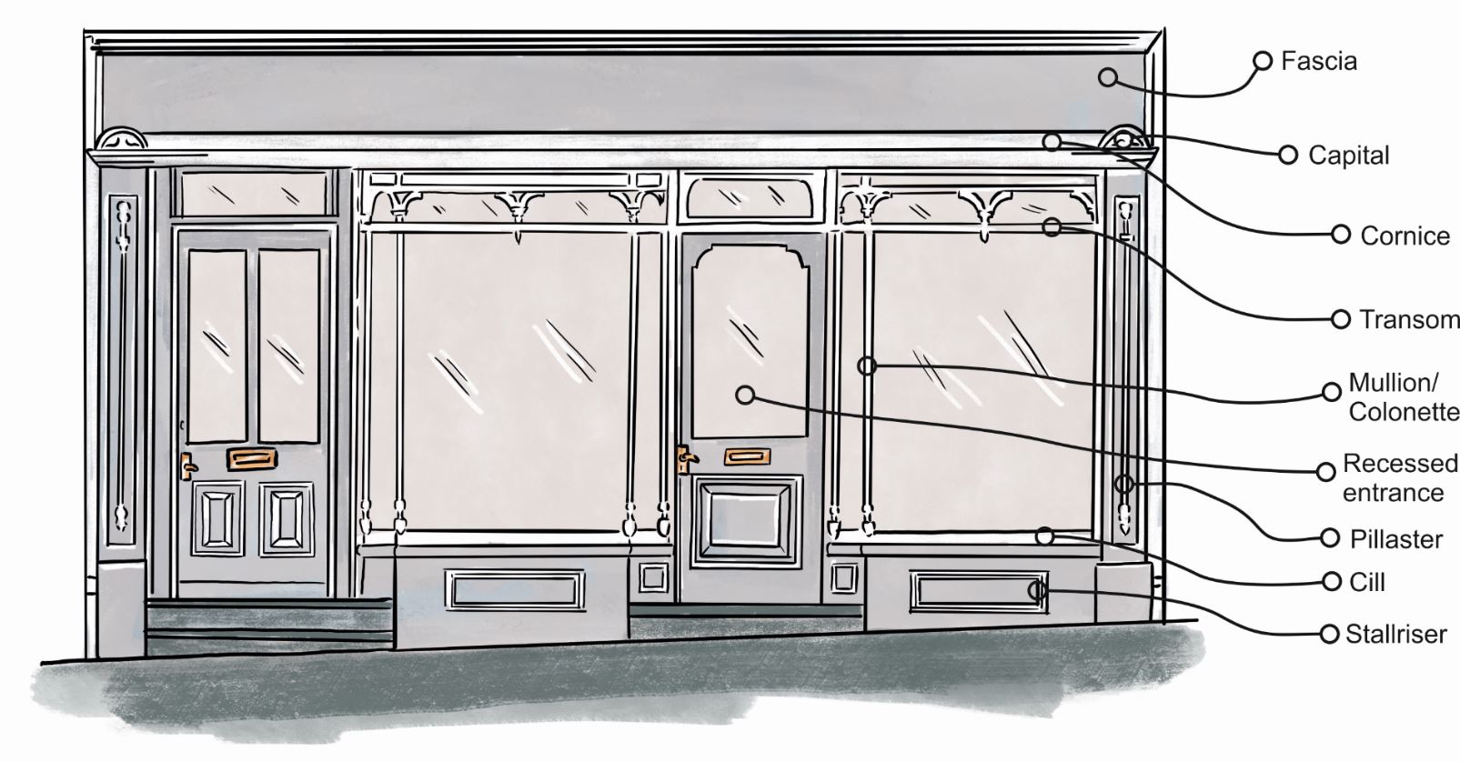
- Detailing - Most traditional shopfronts have a number of basic components; i.e. a panelled or rendered stall-riser to provide a visual base for the shopfront, pilasters to frame the shopfront, a well-proportioned fascia to announce and cap the shopfront, and properly-moulded, vertical glazing bars to break up the areas of glazing. These elements should form an integral part of the shopfront and be in keeping with the period and style of the host building.
- Materials - The traditional material for shopfronts is painted timber and this remains the most suitable choice in historic contexts. Not only does it enable the accurate replication of mouldings and details, but it is also a renewable resource free from the harmful dioxins and chemicals found in many plastic and metal equivalents. These modern materials are also resisted on visual grounds where the end result would look flat and featureless.
- Colour - The careful use of colour can greatly heighten the overall design through the emphasis of detail and by creating a unity through the façade. Generally dark colours work best in association with creams and whites. Strident and garish colours will be resisted as they are not appropriate in rural North Norfolk.
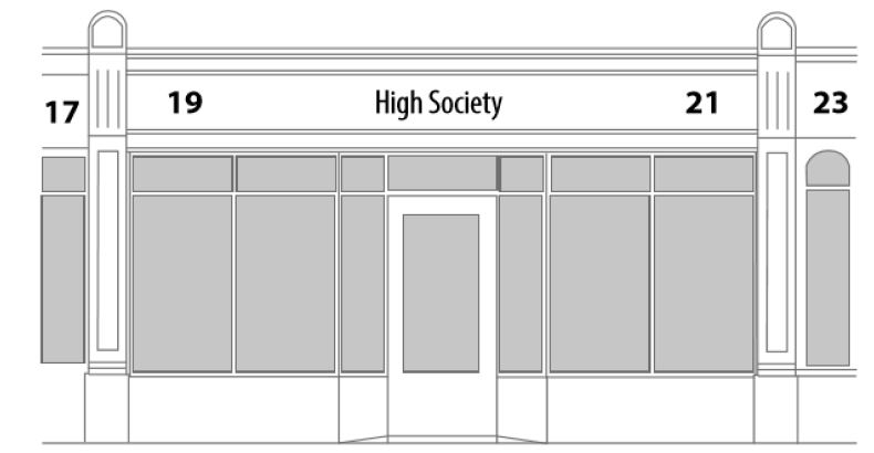
The illustration below shows a modern shopfront which still successfully picks-up on those traditional proportions and details.

Key Considerations
-
Respect scale and proportion of elevation above
-
Retain space below cill
-
Keep cornice/fascia below top of consoles
-
Fascia contained within pilasters and shop unit
-
Fascia max 1/5 of height from top of pavement
-
Sign name and number max 3/5 of fascia
-
Ensure vertical emphasis to mullions
