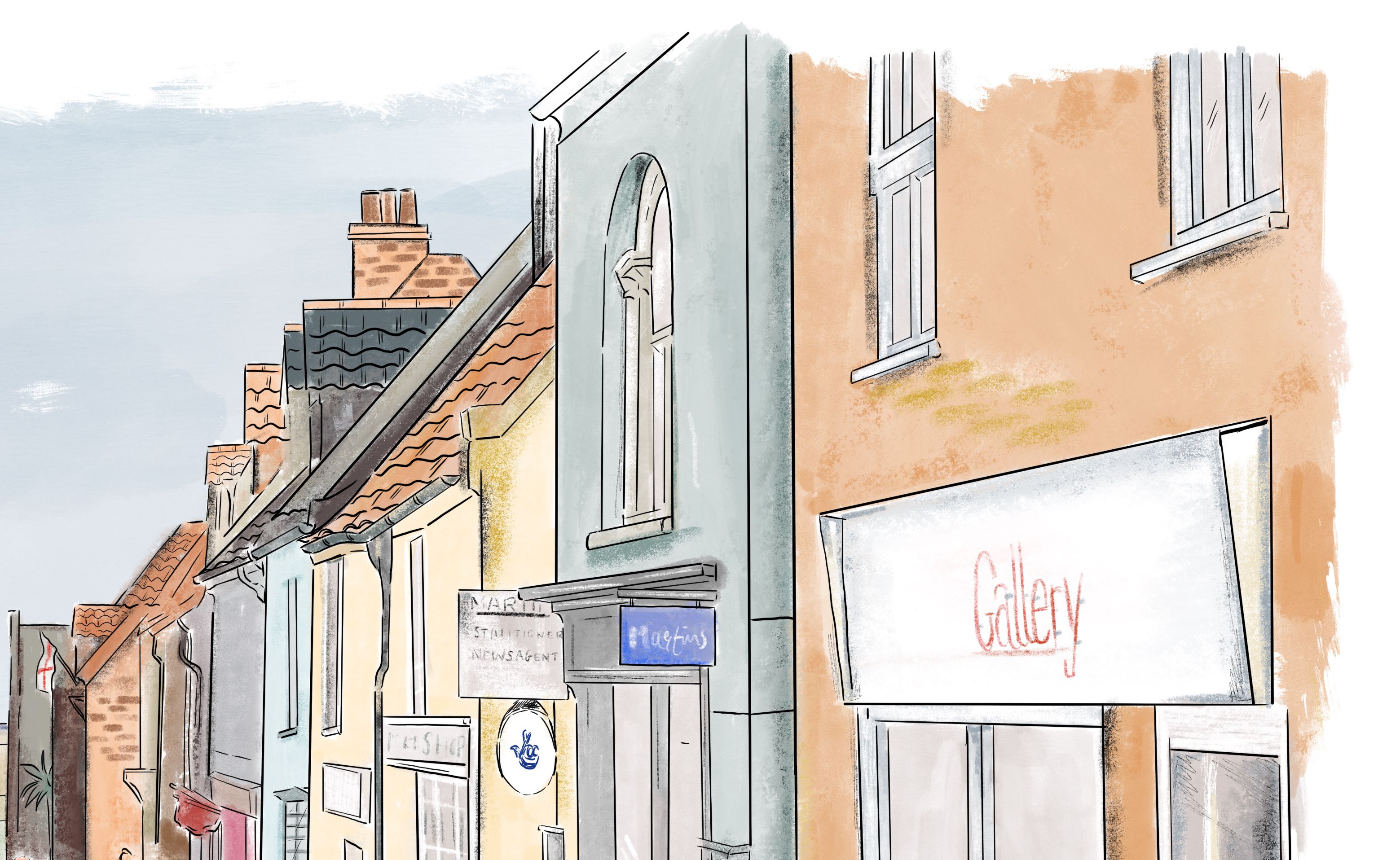
In order to help guarantee the viability of our commercial premises, and thus the vitality of our town centres, all businesses should be able to advertise themselves successfully. At the same time, however, their advertisements need to pay due regard to their surroundings and be part of the overall design of the host building. Scale, form, detailing, lettering style and colour are the key determinants in achieving this and in ensuring that a new advertisement does not appear as an unsympathetic appendage. The following sections offer practical advice on the main sign types: -
Fascia Boards
Wherever possible, fascia boards should be an integral part of a shopfront. Where this is not possible, the board should be edged with a properly moulded timber frame. Hand painted finishes are preferred particularly for historic buildings and conservation areas. However, other surface materials can be considered providing they have non-reflective finishes and restrained colours. The board itself should be sized to fit comfortably between window openings without obscuring arches and sills.
Sign Boards
Where a fascia is undesirable, small sign boards fixed alongside an entrance door, or on an end gable, can often be adequate. Again, hand painted signs are the preference in historic contexts but they are not the only solution. Often metal plaques can provide an attractive alternative, particularly when advertising legal practices. Such signs should be restricted in number and size to prevent visual clutter.
Hanging Signs
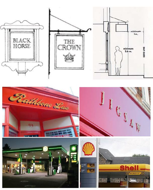
Hanging signs are a traditional method of drawing attention to business premises when viewed along a street. As such, their use is normally encouraged subject to their size, design and position on a building. Hanging signs should be restrained in size and not more than 0.9m x 0.6m. They are probably most effective as a simple framed rectangle with its shortest side attached to an iron bracket. However, individually-shaped trade symbols can also be successfully hung in this way. They are best sited between first floor windows taking care not to overhang the highway.
Petrol Stations & Garages
The LPA accepts that the travelling public need to be able to readily identify the presence of a garage in daylight and in darkness. Consequently, the need to display obvious advertisements is recognised. However, it is expected that all contraints regarding height and numbers of advertisements will be observed and that signs will be designed and presented in an orderly way. Lettering and decorative strips attached to the fascia of a canopy are particularly intrusive and should be avoided.
Parish Notice Boards
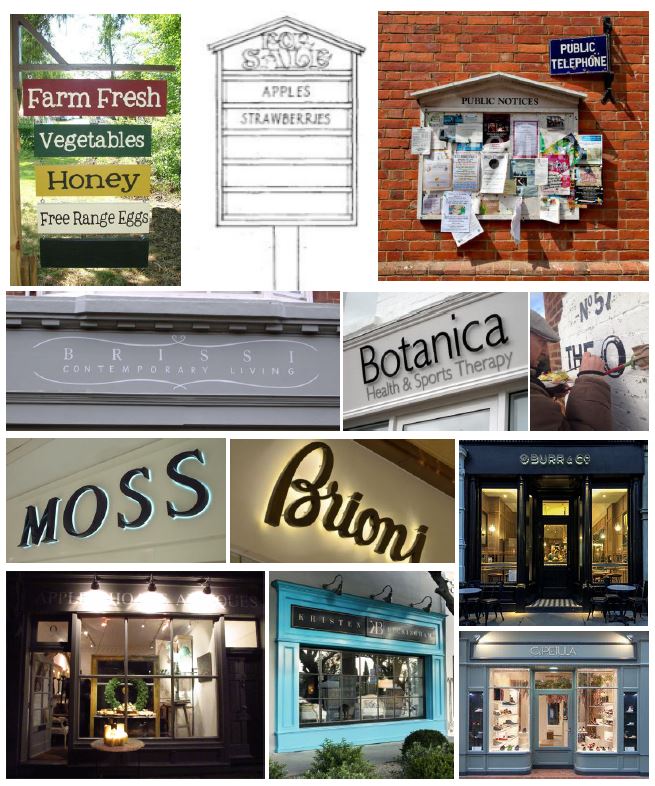
The provision of small well-designed notice boards at appropriate points in a village will be encouraged as an alternative to unsightly fly-posting.
Sale of Produce Signs
These signs frequently appear in rural areas advertising the sale of farm produce, flowers, etc. Often home made, these signs can remain in place for long periods to cover the seasonal availability of produce. The LPA will make every effort to encourage the display of properly designed signboards that have inter-changeable slats allowing details to be varied as required.
Advance Warning or Directional Signs
The LPA rarely allows advance warning signs on the basis that they can create inappropriate visual clutter, particularly in rural areas. Moreover, they are likely to be a distraction to drivers and could prejudice highway safety. On the rare occasions that they are necessary, such signs should be limited to a ‘finger post’ style, similar to those drawing attention to public footpaths. Where signs are required for tourist attractions, they should be ‘brown signs’ as erected by the Highway Authority.
Lettering
In any advertisement, the choice of lettering can hugely influence appearance. Therefore, care should be taken in selecting a font which reflects the character of the building rather than the nature of the business. The size of letter should have a comfortable relationship with the depth of the fascia or the overall size of the sign, whilst clarity and impact should rely on well chosen colours rather than excessive size. Light coloured lettering on a dark background is usually most effective. Individual letters in a classical style fixed directly to the wall can be acceptable where a fascia board is not appropriate.
Illumination
Illumination has a role to play in energizing our settlements and making them attractive places, particularly in the winter months. However, care needs to be taken to ensure that the mode of illumination is appropriate for its surroundings. Within North Norfolk, the low-key nature of our market and coastal towns is in contrast with some of the bigger seaside resorts where high impact advertising is the norm. Hence, the emphasis will continue to be on the discreet use of trough lighting rather than internally illuminated box signs and fascias. However, the latter may occasionally be accepted where the illumination levels are restrained and restricted to the lettering or logo only. Internally-illuminated, individually-applied letters may also be considered where only the outline of the letter is illuminated (known as halo illumination).

Example hanging signs, fascia advertisement and large scale garage totem and signage

Successful sign and lettering types and examples of low key modes of illumination.
